1. The aperture settings range from f/2.8 to f/22.
2. The shutter speed settings range from 1 second to 1/4000 of a second.
3. The ISO settings range from ISO 100 to ISO 25600
Monday, September 26, 2016
ISO
(Photo taken at ISO 200)
(Photo taken at ISO 1600)
1. The advantages of shooting at a higher ISO at a sporting event at night is the increased capture time. The photos will also be brighter at a higher ISO.
2. The author recommends using low ISO when there is plenty of light or if you have your camera mounted in a dark environment.
3. The author recommends using a high ISO when there is not enough light or when trying to capture something in motion.
Shutter Speed
(Photo taken at 1/2000 Shutter Speed)
(Photo taken at 4-second Shutter Speed)
During The Day
1a) Medium Shutter Speed
1b) Medium Shutter Speed
1c) High Shutter Speed
1d) High Shutter Speed
1e) High Shutter Speed
1f) High Shutter Speed
At Night
1a) Low Shutter Speed
1b) Low Shutter Speed
1c) High Shutter Speed
1d) Low Shutter Speed
1e) Low Shutter Speed
1f) High Shutter Speed
2. Aperture Priority mode lets you choose the camera's aperture, but automatically chooses the shutter speed. Shutter Priority mode lets you choose the camera's shutter speed, but automatically chooses the aperture. Manual mode lets you choose both the shutter speed and the aperture.
Aperture
(Photo taken at F/2.8 Aperture)
(Photo taken at F/16 Aperture)
1. We should closely relate aperture to the pupil of a human eye.
2. The smaller the aperture, the larger the f-number. The larger the aperture, the smaller the f-number.
3. A smaller aperture results in a smaller depth of field. A larger aperture like F/16 or F/32 will result in a photograph with everything in focus (subject and background).
Friday, September 23, 2016
Great Black and White Photographers, PART 2
Lee Friedlander was born in Aberdeen, Washington (July 14, 1934) and is currently 82 years old. He studied for two years at the Art Center College of Design in Pasadena before moving to New York at the age of 36. He mainly worked for Atlantic Records, shooting pictures of the company's musicians. As a side job, he worked as a freelance photographer for magazines like Collier's, Esquire, McCall's, and Sports Illustrated. Lee mainly photographed New York's busy streets and social scene. His self-portraits, which he began taking in the 1960's, are his most widely renowned pictures. Friedlander has published countless books (more than 50) displaying his photography. Some of his most recent ones are The Nudes: A Second Look, Mannequin, In the Picture: Self-portraits, America by Car, and Witness Number 6.
Sources:
https://www.britannica.com/biography/Lee-Friedlander
https://fraenkelgallery.com/artists/lee-friedlander
Wednesday, September 21, 2016
Academic Shoot
Rule of Thirds:
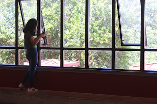
1. For this image, I followed the rule of thirds.
2. The subject is the girl taking a picture.
3. Yes, I think the subject of the photo is easily identifiable.
4. The subject is already clear, I don't need to do anything different.
Simplicity:
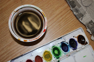
1. For this image, I followed the rule of simplicity.
2. The subject is the cup of paint-water.
3. The subject isn't very clear, the colorful paints clash with it.
4. To improve my photo, I could replace the paints with something less dynamic or completely remove them.
Framing:
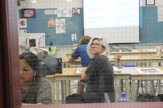
1. For this image, I followed the rule of framing.
2. The subject is the girl turned around in the center of the class.
3. I think it's pretty easy to tell she's the subject, but the other people draw attention away from her.
4. To improve it, I could wait until there's only a single person in my shot.
Balance:
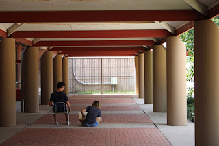
1. For this image, I followed the rule of balance.
2. The subjects are the two students sitting and drawing.
3. Yes, I think the subject of the photo is very apparent.
4. The subject is already clear, I don't need to do anything different.
Lines:
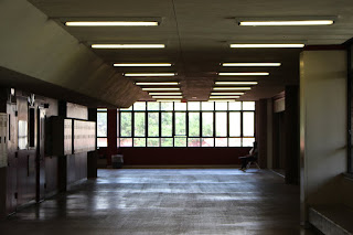
1. For this image, I followed the rule of using lines.
2. The subject of this picture is the panel of windows at the end of the hallway.
3. I think it's semi-clear, but it could've been improved.
4. I could get closer to the windows or maybe have someone stand in front of them and have them be the subject instead.
Merger:
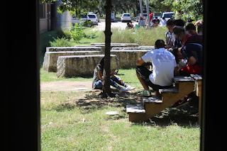
1. For this image, I intentionally shot a merger photo.
2. The subject is the one girl sitting on the grass.
3. She's not clear because she is merging with the tree, it's almost entirely covering her up.
4. To improve, I could have the girl sit in a clear patch of grass with no trees or other obstacles around.

1. For this image, I followed the rule of thirds.
2. The subject is the girl taking a picture.
3. Yes, I think the subject of the photo is easily identifiable.
4. The subject is already clear, I don't need to do anything different.
Simplicity:

1. For this image, I followed the rule of simplicity.
2. The subject is the cup of paint-water.
3. The subject isn't very clear, the colorful paints clash with it.
4. To improve my photo, I could replace the paints with something less dynamic or completely remove them.
Framing:

1. For this image, I followed the rule of framing.
2. The subject is the girl turned around in the center of the class.
3. I think it's pretty easy to tell she's the subject, but the other people draw attention away from her.
4. To improve it, I could wait until there's only a single person in my shot.
Balance:

1. For this image, I followed the rule of balance.
2. The subjects are the two students sitting and drawing.
3. Yes, I think the subject of the photo is very apparent.
4. The subject is already clear, I don't need to do anything different.
Lines:

1. For this image, I followed the rule of using lines.
2. The subject of this picture is the panel of windows at the end of the hallway.
3. I think it's semi-clear, but it could've been improved.
4. I could get closer to the windows or maybe have someone stand in front of them and have them be the subject instead.
Merger:

1. For this image, I intentionally shot a merger photo.
2. The subject is the one girl sitting on the grass.
3. She's not clear because she is merging with the tree, it's almost entirely covering her up.
4. To improve, I could have the girl sit in a clear patch of grass with no trees or other obstacles around.
Wednesday, September 14, 2016
Academic Prompt Shoot
1. I think I could take photos like the ones I looked at today in a science or an art classroom.
2. I would like to shoot my photos in Ms. Lejeune's art room.
3. To get amazing photos like the ones I saw today, I can try new perspectives of things to make my images more dynamic and unique. I could get very low to the ground and shoot upwards or vice-versa.
2. I would like to shoot my photos in Ms. Lejeune's art room.
3. To get amazing photos like the ones I saw today, I can try new perspectives of things to make my images more dynamic and unique. I could get very low to the ground and shoot upwards or vice-versa.
2012 Jostens Photo Contest
1. My favorite photo from the Academics & Community Service category in the 2012 Jostens Photo Contest is "Quantum Mechanics" by Hannah Kunz. I think it shows an interesting and unique perspective of the boy from the other side of the clear whiteboard. He looks very intent with his writing and the lighting is also very nice. It highlights the right side of his face.
2. The Rule of Thirds is evident in this photo (the subject's head is placed in the right third of the image.) Lines are also used with the arrows he is drawing. The photograph has a nice, simple background and his right hand is closer to the camera, which balances out with the rest of the body on the other side of the picture.
2. The Rule of Thirds is evident in this photo (the subject's head is placed in the right third of the image.) Lines are also used with the arrows he is drawing. The photograph has a nice, simple background and his right hand is closer to the camera, which balances out with the rest of the body on the other side of the picture.
Filling the Frame
I think this picture does a great job of filling the frame. The subject of the photo is clearly shown and the books fill up most of the negative space. One thing I don't like is how a small part of her head is cut off at the top.
Action and Emotion
I think this photograph displays the best action because it shows students performing an extremely cool looking science project. Emotion-wise, even though I can't see their faces behind the masks, I would assume both the kids are currently full of awe.
The Story
This photo was titled "Feeding the Homeless." I think this image tells the best story visually because it portrays a group of generous young children who are dedicating their day to helping those in need.
Monday, September 12, 2016
Post Shoot Reflection
1. During my first shoot, I had a hard time coming up with original ideas to meet the four prompts.
2. I found myself mainly thinking about composition and alignment during the shoot. While taking pictures of the hallways, I made sure to make the top of the photo level with the ground.
3. If I could do the assignment again, I'd shoot my same photos with better composition.
4. I would choose the same subjects, because I like the things I chose to shoot.
5. During my shoot, I managed to achieve photos that incorporated lines, framing, and the rule of thirds.
6. I'm not interested in shooting these same prompts again. I want to move onto new, more interesting things.
Friday, September 9, 2016
Merger
Framing
Balance
Lines
Rule of Thirds
Simplicity
Friday, September 2, 2016
The Camera History and Basic Functions
1. Explain the "camera obscura" effect. How is it achieved?
Inside a completely dark room, a tiny hole is created in one wall. Through the hole light is focused, and the outside scene is projected (upside down) on the opposite wall.
2. What invention during the 17th Century helped man get a step closer to creating the modern camera?
The understanding of optics and the process of making high quality glass lenses.
3. What were the parts of the first modern camera invented by Niepce?
He invented film.
4. What do modern digital cameras have in common with Niepce's camera?
A digital camera is still composed of a lens, a dark box, and film.
5. What do digital cameras use to capture an image?
An electronic sensor called a CCD.
6. What is the difference between the Auto mode and the Program mode?
Auto mode is fully automatic, whereas you can control certain things like flash in Program mode.
7. What is the Portrait mode used for? How does it work?
To attempt to blur out the background, the camera will try to use the fastest available lens setting (aperture).
8. What is the Sports mode used for? (not just sports) How does it work?
To freeze motion, camera will use the highest shutter speed possible.
9. Why should you do a half press on the trigger button?
It increases the camera's response time, gives you more control over focus, and encourages better composition.
10. What does this symbol mean? When would you use this?
Auto-Flash. You'd use this when in default mode.
11. What does this symbol mean? When would you use this?
Disabled flash. You'd use this when you want natural light.
12. What happens to your photo if there is too much light?
The picture will be washed out.
13. What happens to your photo if there is not enough light?
The picture will be too dark.
14. What is a "stop."
A relative change in the brightness of light.
15. How many stops brighter is the new planet if there are two suns instead of one?
One stop.
16. How many stops brighter is the new planet if there are four suns instead of one?
Two stops.
17. What affect does a longer shutter speed of have?
Lets more light into the picture.
18. What affect does a shorter shutter speed have?
Lets less light into the picture.
19. What does the aperture control?
It closes up to restrict light and opens up to let light through.
20. When adjusting the aperture, how can you increase the amount of light?
Choose a lower aperture.
Subscribe to:
Comments (Atom)


